heckin simple meta balls
metaballs!! we’re making metaballs!
I love metaballs, you shall now love them too. they’re extremely easy to make, I promise.
today we’ll implement them with mostly css, and some javascript to move them around.
go go go
lets just jump head first, straight into it. first we’ll implement them using css and javascript. you can do it with just css, but javascript makes moving them around easier.
create a folder somewhere, make a file named index.html and style.css. in index.html, get the boiler-plate out of the way
<!DOCTYPE html>
<html lang="en">
	<head>
		<meta charset="UTF-8">
		<meta name="viewport" content="width=device-width, initial-scale=1.0">
		<title>Meta Balls</title>
		<link rel="stylesheet" href="style.css">
	</head>
	<body>
		...
	</body>
</html>
in the body tag,
<div class="container">
	<div class="circle"></div>
	<div class="circle"></div>
</div>
and then in style.css,
body {
	margin: 0;
	padding: 0;
}

.container {
	background: black;

	width: 100%;
	min-height: 100vh;
}

.circle {
	background: #f0f;
	border-radius: 50%;

	width: 8rem;
	height: 8rem;
}
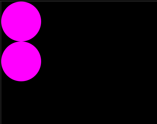
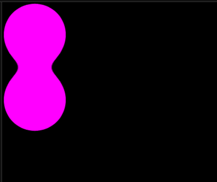
running index.html makes this:
it’s important that the container div’s background is opaque. otherwise, the effect won’t work well.
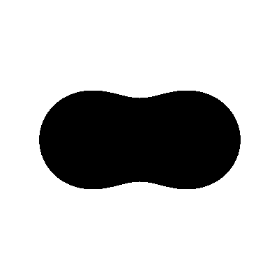
how do meta balls work though?
but seriously how
here’s a simple method!
say we have a point, a.
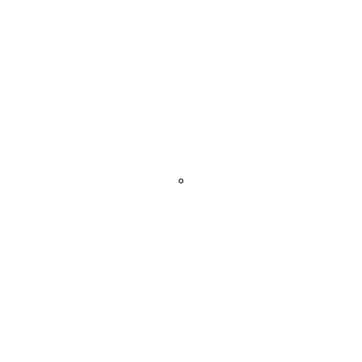
for every position around a, the position’s color is the distance from a, or rather the inverse distance.
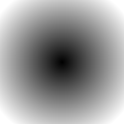
now we make a threshold, anything below this threshold is set to nothing, anything above is set to white.
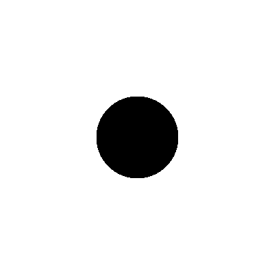
a circle! but theres more. let’s add another point, b, and now for every position, we go through every point and set the position color to the sum of all inverse distances, then threshold.
metaballs!!
that’s how they work. how do we recreate this in css?
css timeee
first, we can get a crude recreation of the distance by using the blur() function on the circle divs.
.circle {
	background: #f0f;
	border-radius: 50%;

	width: 8rem;
	height: 8rem;

	filter: blur(20px); /* <--- */
}
if the circle blurs outside the parent container div, it will cause some visual issues, so lets hide the overflow:
.container {
	background: black;

	width: 100%;
	min-height: 100vh;

	overflow: hidden; /* <--- */
}
okay then! now we need to turn that blurred mess into something not blurred. we can do that by applying a contrast() filter, which, if you pass in a value higher than 1(we will use 30), will force colors closer to their largest possible value. for example, a color like rgb(200, 100, 200) with a huge contrast will make it into something like rgb(255, 0, 255). that’s basically thresholding!
(the brightness() filter can also do something like this. my example implementation I link later uses this.)
.container {
	background: black;

	width: 100%;
	min-height: 100vh;

	overflow: hidden;

	filter: contrast(30); /* <--- */
}
two pink circles melting into each other
hey, those are melting into each other. metaballs!!
js time
oh.
well it’s the least tedious way to animate them, imo. lets just get into it, create a file named script.js, remove the circle divs from index.html, and add a script tag.
<div class="container"></div>
<script src="script.js"></script>
in script.js,
const container = document.querySelector('.container');

for (let i = 0; i < 3; i++) {
	const elm = document.createElement('div');
	elm.classList.add('circle');
	container.appendChild(elm);
}
we need to be able to move these around, so lets create a little blob class to represent a circle’s state.
const container = document.querySelector('.container');

class Blob {
	constructor() {
		this.elm = document.createElement('div');
		this.elm.classList.add('circle');

		container.appendChild(this.elm);
	}
}

const blobs = [];
for (let i = 0; i < 3; i++) {
	blobs.push(new Blob());
}
in style.css, let’s make the circle divs absolute.
.container {
	background: black;

	width: 100%;
	min-height: 100vh;

	position: relative; /* <--- */
	overflow: hidden;

	filter: contrast(30);
}


.circle {
	background: #f0f;
	border-radius: 50%;

	/* +++ */
	position: absolute;
	left: 50%;
	top: 50%;
	/* +++ */

	width: 8rem;
	height: 8rem;

	transform: translate(-50%, -50%); /* <--- */

	filter: blur(20px);
}
back in script.js! we’ll store the circle position in the blob object, represent the positions of the divs as percentages, so that the script works in any aspect ratio. we’ll also store it’s movement direction.
we’ll also randomize the size of the divs. update the blob class:
class Blob {
	constructor() {
		this.elm = document.createElement('div');
		this.elm.classList.add('circle');

		const size = Math.random() * 6 + 6
		this.elm.style.width = size + "rem";
		this.elm.style.height = size + "rem";

		container.appendChild(this.elm);

		this.x = 50;
		this.y = 50;
		this.x_vel = (Math.random() * 2 - 1) / 10;
		this.y_vel = (Math.random() * 2 - 1) / 10;
	}
}
also add an update method. every update, we’ll move the ball by it’s -_vel, and then if it’s outside the bounds, as in below 0% or above 100% in any direction, just flip the -_vel direction. (this is why I chose to represent positions as percentages)
class Blob {
	constructor() { /* ... */ }
	update() {
		this.x += this.x_vel;
		this.y += this.y_vel;

		if (this.x < 0 || 100 < this.x) this.x_vel *= -1;
		if (this.y < 0 || 100 < this.y) this.y_vel *= -1;

		this.elm.style.left = this.x + "%";
		this.elm.style.top = this.y + "%";
	}
}
and finally, we need to let this update on every (possible) frame.
function frame() {
	for (let i = 0; i < blobs.length; i++) {
		blobs[i].update();
	}

	requestAnimationFrame(frame);
}

frame();
and that’s it! it’s that simple! behold the metaballs!!
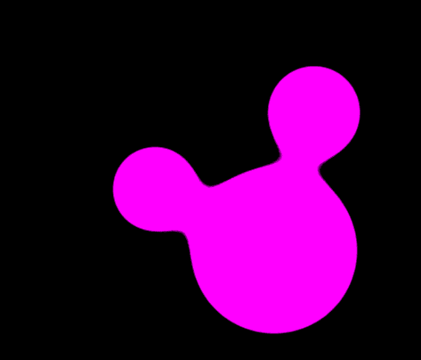
yay
yep. that’s all I have for now, have a nice day :3